Die Produkt-Website entsteht
When we set out to build the Toolio product website, we had a clear choice: use a template and ship fast, or build from scratch and ship something that actually represents what we stand for. We chose the latter. Not because we enjoy making things harder for ourselves, but because a landing page is the first product experience. If the website feels generic, people assume the product is too.
Why we skipped the template
Templates solve the 80% case. They give you a hero section, a feature grid, a pricing table, and a footer. But Toolio is not an 80% product. We are building a platform that replaces five different tools for service businesses, and we needed the website to communicate that density without feeling cluttered. Templates impose layout assumptions that fight the story you are trying to tell. We needed full control over the hierarchy, the pacing, and the visual rhythm of every section.
The stack: Next.js 16, Tailwind 4, next-intl
The site runs on Next.js 16 with the App Router, styled with Tailwind CSS 4, and localized with next-intl. This combination gives us server-side rendering for SEO, utility-first styling for speed, and robust internationalization out of the box. We support four languages — English, German, French, and Spanish — with over 250 translation keys. The currency display adapts automatically based on the visitor's location: visitors from Europe see EUR, from Switzerland CHF, from the UK GBP, and everyone else sees USD.
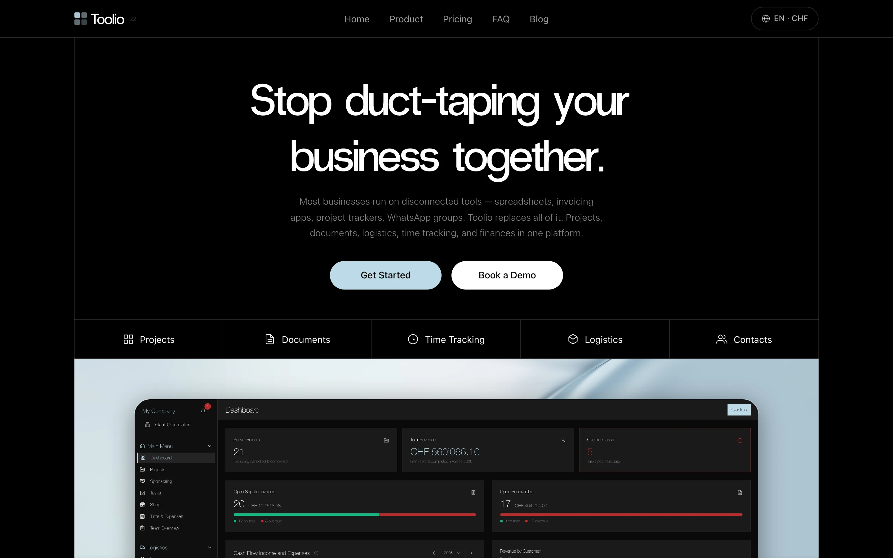
The hero section: bold headline, clear CTAs, and a live dashboard preview that sets expectations immediately.
Dark theme, minimal chrome, maximum data
The design follows a strict dark theme: #0a0a0a backgrounds, white text, and a cool accent color (#bcdae6) that provides contrast without screaming. Headings use RadioGrotesk for a sharp, technical feel. Body text uses Helvetica Neue 300 for readability at smaller sizes. Every section lives inside a max-width container with consistent padding, and subtle 1px borders create visual separation without visual noise. The design philosophy is borrowed from data dashboards: show the information, strip away everything that is not the information.
A custom WebGL shader for atmosphere
The modules section features a custom SpecularBand animation — a WebGL shader built with Three.js that creates a subtle light play across the card backgrounds. It gives the otherwise static dark page a sense of depth and movement. We kept it performance-conscious: the shader only renders when the section is visible, uses requestAnimationFrame efficiently, and gracefully degrades on devices that do not support WebGL. A single seamless animation runs behind all three module cards rather than three separate instances, creating a fluid visual connection between them.
Transparent competitor comparison
One of the most effective sections on the page is the comparison table. Instead of vague claims like "better than the competition," we list 13 specific features and show exactly which ones Toolio, Productive, and bexio support. Checkmarks, X marks, and "Add-on" labels make the gaps visible at a glance. The data is based on actual research of each competitor's public feature pages — not assumptions. This approach respects the visitor's intelligence and builds trust through transparency.
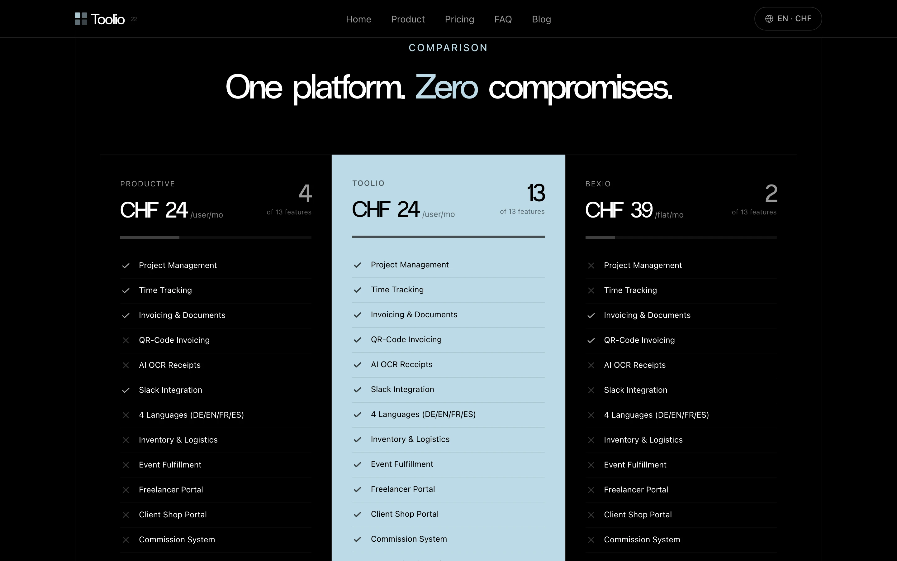
The comparison section: Toolio in the center with its accent background, competitors on either side. Thirteen features, clear indicators, no ambiguity.
Modular pricing, modular messaging
Toolio is built around three modules — Core, Logistics, and Team — and the website reflects that architecture. Each module gets its own card with a rotating preview of what the interface looks like in practice. The pricing section mirrors this structure: start with Core, add Logistics if you need warehouse and fulfillment, add Team if you manage freelancers and commissions. The website makes this progression intuitive rather than overwhelming.
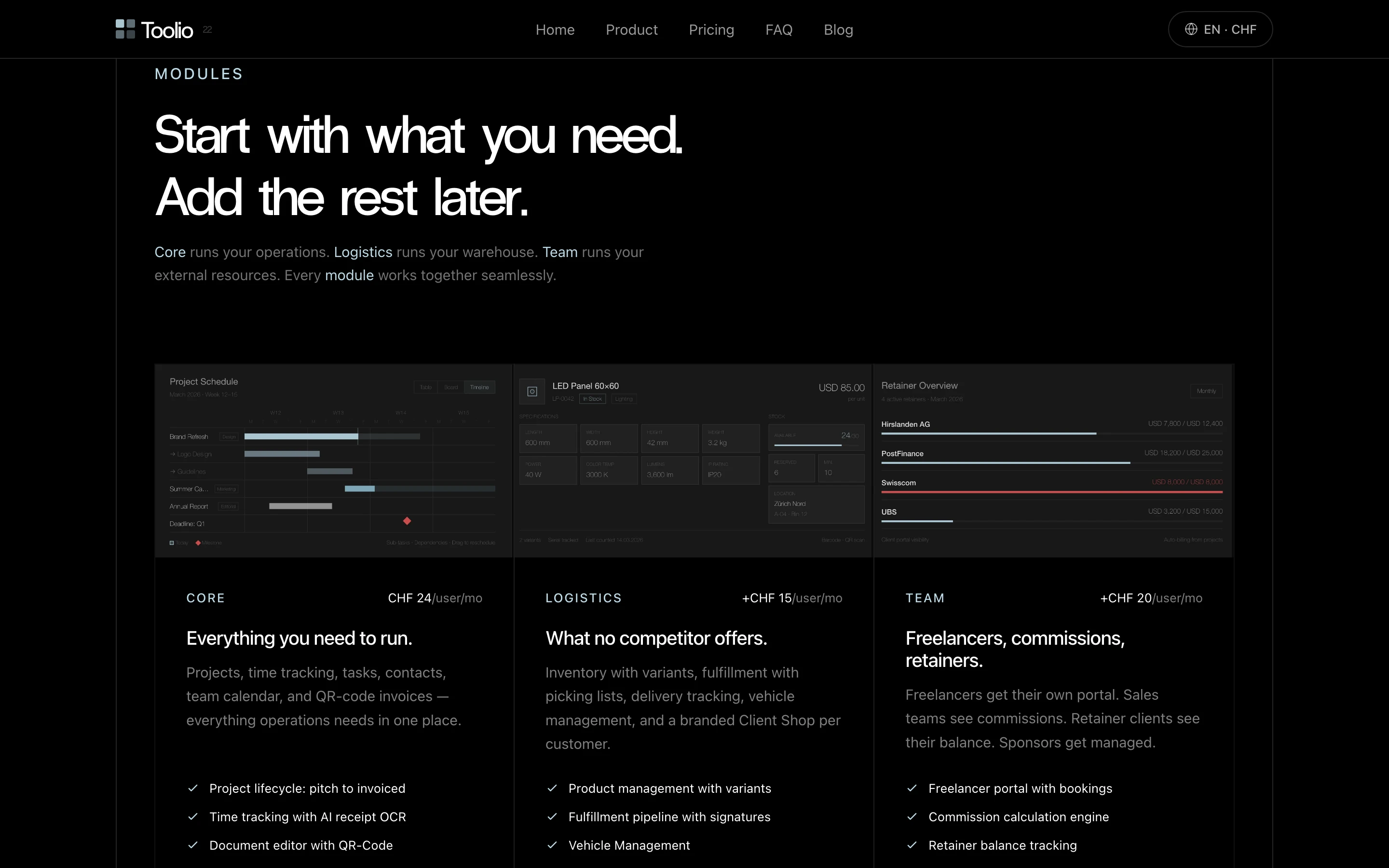
The modules section: three cards with rotating interface previews, feature lists, and clear add-on pricing.
Built entirely with AI assistance
This website was built entirely with Claude, Anthropic's AI coding assistant. Every component, every translation, every design iteration was done in conversation. The workflow: describe what you want, review the output, refine, and ship. Claude handles the implementation — from the responsive grid layout to the shader code to the SEO metadata. The human provides direction, taste, and final approval. The entire site, including four complete language translations, the GEO optimization, and 180+ feature catalog, was built and deployed in a single day.
Building in public means showing the process, not just the result. This website is the first artifact of that commitment. We will keep writing about the decisions behind Toolio — the technical choices, the design trade-offs, and the things we got wrong. If you are building a SaaS product and thinking about your own landing page, we hope this gives you a useful reference point.